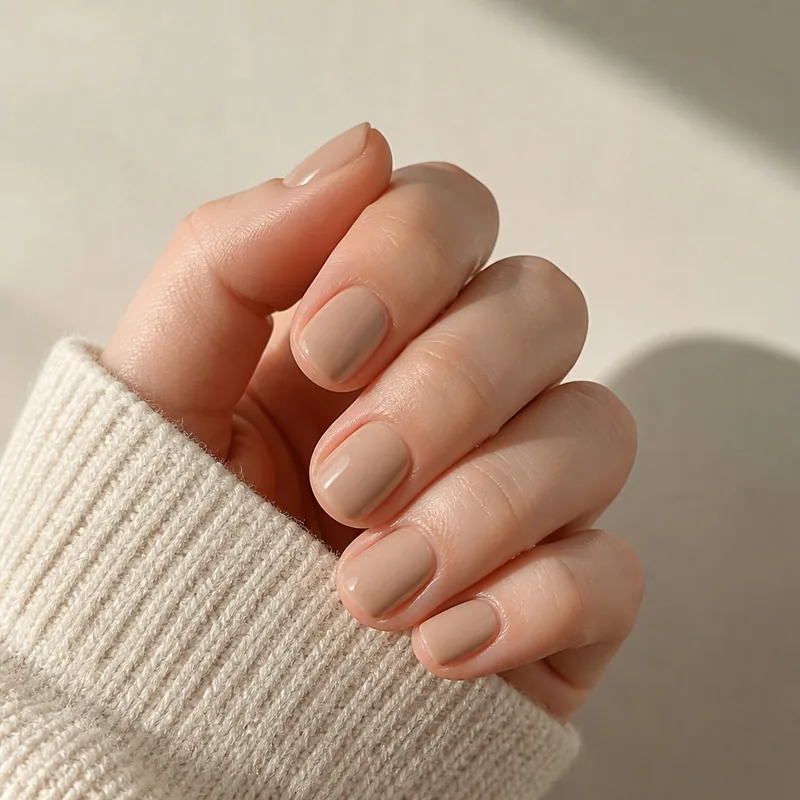
Choose the color direction first, verify opacity and finish, then check the exact set’s fit and instructions. Use photographs and palettes as references rather than exact shade guarantees.
Read beyond the shade name
Names such as blush, nude, or milk do not establish opacity. Look for a written description as well as photographs. Sheer covers allow more of the background to show through; opaque covers are intended to conceal it. A French design can combine a translucent base with a more opaque tip.
For a documented example, Glamnetic lists Bark Brown as glossy and opaque. Olive & June maintains a separate sheer press-on collection and describes Blush Syrup Gradient as a warm-toned tawny blush. These are descriptions of particular products, not a rule for every brown or pink set.
| Detail | What to compare |
|---|---|
| Color family | Pink, red, brown, blue, green, or another starting point |
| Depth and undertone | Light or deep; a peach, yellow, blue, or gray lean within the family |
| Opacity | Sheer, semi-transparent, or opaque; ask if the listing is unclear |
| Finish | Glossy, matte, shimmer, metallic, or a mixed finish |
Jelly press-on nails: compare the translucent look
For a jelly press-on look, check how much color and transparency the finished cover has. Glamnetic describes its Sheer Peach design as semi-transparent with a glossy finish. That is a documented example, not an opacity rating shared by every set named jelly.
Compare photos of the exact length and shape on a hand, including the free edge. Ask for a close-up if the listing only shows a packaged set. A pale opaque pink and a translucent pink can share a similar shade name while giving different coverage.
Jelly appearance does not establish the cover’s fit, flexibility, or attachment method. Check the actual set’s instructions separately. A sheer-looking cover is not, by itself, evidence that a particular light-cured adhesive is compatible with it.
- Choose the coverage you want: a clearly see-through tint, a more diffused milky look, or an opaque color. Ask the maker which description fits the exact variant.
- Check each part of a mixed design. A translucent base can sit beneath an opaque French tip or decoration; the whole nail may not have the same opacity.
Four original palettes to narrow your search
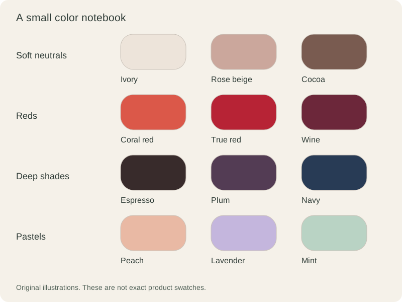
These palettes are starting points for comparing finished sets. Pick one shade for a uniform manicure, or look for a coordinated multicolor set. The illustration is an original color study, not a photograph, a product swatch, or a promise that a matching set is available.
- Soft neutrals: ivory, rose beige, and cocoa. Compare how much contrast you want against your hand or clothing. Neutral does not mean one universal skin-matching shade.
- Reds: coral red, true red, and wine. Choose between a brighter orange-leaning direction and a deeper berry direction; compare the exact finish before deciding.
- Deep shades: espresso, plum, and navy. Look for close-up images that show the color itself, since a very deep shade can look nearly black in a small thumbnail.
- Pastels: peach, lavender, and mint. Decide whether you want a solid pastel or a translucent effect, then confirm that the product description supports that choice.
Compare the shade in the setting where you will wear it
Use undertone language to describe a color you like, not as a rule about which colors you are allowed to wear. You may prefer a close match, a clear contrast, or a shade that picks up a detail in an outfit. There is no need to choose a skin-tone category first.
View several photographs of the same exact style: the loose nails, the packaged set, and the nails on a hand. If you have a sample, compare it near a window and under the indoor light you normally use. Lighting and display settings can change the appearance; Gelous explicitly notes this limitation in its product details.
A product photo cannot guarantee a precise match to a dress or another brand’s shade name. If an exact match matters, ask the maker about a physical sample before ordering. Avoid judging opacity from a thumbnail against a white background alone.
Write a shortlist before choosing the set
- Choose one color family and note the depth you prefer. Add one alternative rather than comparing the entire catalog.
- Record the stated opacity and finish for each candidate. Mark missing details as unknown instead of filling them in from the shade name.
- Check the same design in your preferred shape and length; a different variant may have a different finish or base color.
- Confirm the size range, underside fit, attachment method, included supplies, and delivery destination. Keep these practical checks alongside the color choice.
A few common questions
Which press-on nail color goes with everything?
There is no universal choice. Compare a neutral that works with the clothes you wear most, or choose a contrast you enjoy. The same shade can look different with a glossy, matte, or sheer finish.
Does a pale press-on color mean it is see-through?
No. Color and opacity are different properties. Look for an explicit sheer, semi-transparent, or opaque description, and ask the maker when the listing leaves that unclear.
Can I use these palettes to paint my own press-ons?
They can inspire a layout. The separate DIY guide covers suitable blanks, compatible coatings, and decorating before attachment; this guide focuses on selecting finished designs.
Sources & reading notes
This guide explains general considerations. Product labels and instructions vary, so check the specific kit and adhesive you use.